How to Use Colour Tones for a Cosier Home
Colours influence how a room feels and how people experience a space.
The right palette can:
- Make rooms feel warmer and more inviting
- Enhance natural light
- Create a sense of calm and relaxation
- Add depth and character without clutter
- Complement furniture and décor effortlessly
If you're looking to create a cosy home environment, these trending colour tones are a great place to start.
Find out more: https://www.gaincity.com/furniture-bedding
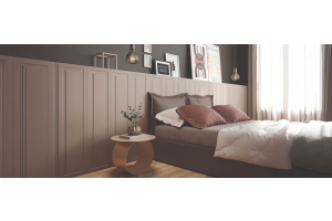
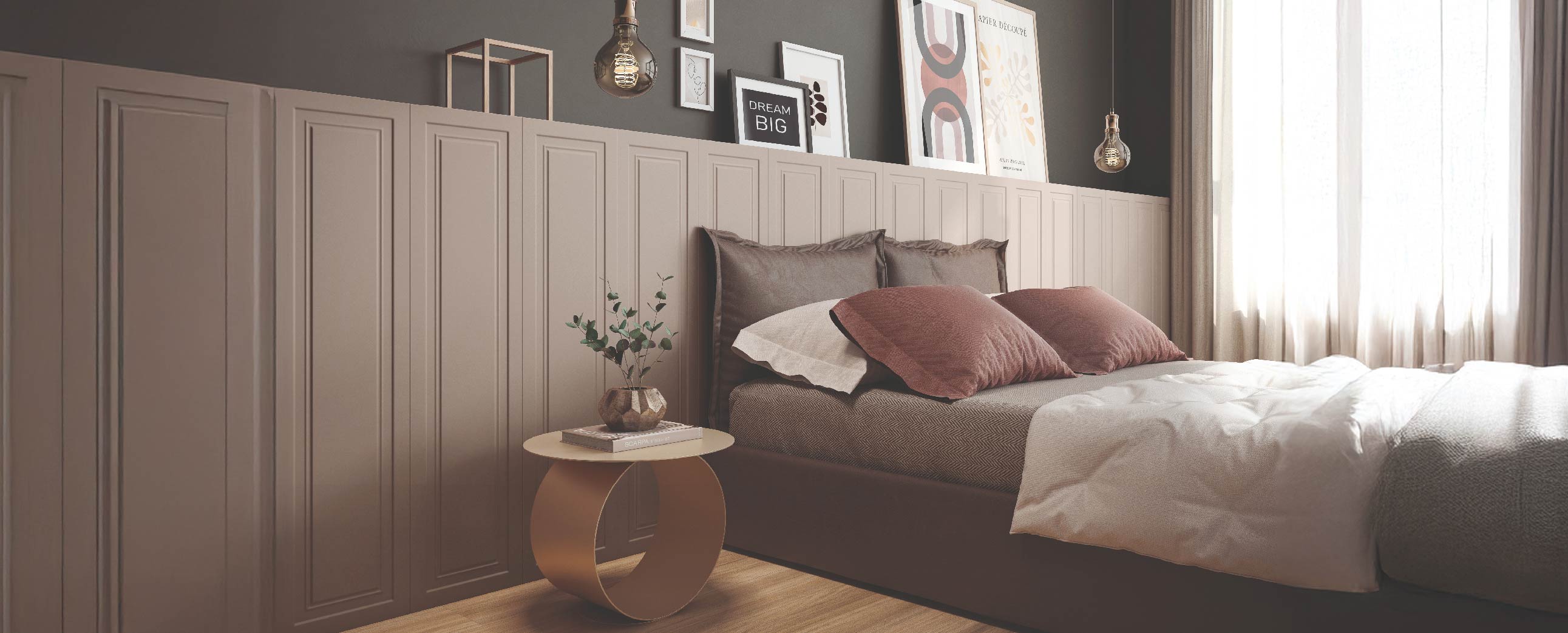
1. Creamy Neutrals for Timeless Comfort
Among the most versatile color tones, creamy neutrals remain a favourite for homeowners seeking a calm and elegant atmosphere.
Popular Shades
- Soft beige
- Warm ivory
- Off-white
- Sand tones
- Cream
Unlike cooler whites, creamy neutrals reflect light gently, helping rooms feel softer and more welcoming.
Why They Work
- Brighten spaces without feeling stark
- Pair beautifully with wood and natural textures
- Create a relaxing backdrop for everyday living
- Work well in both modern and classic interiors
Best Places to Use Them
- Living room walls
- Sofas and upholstered furniture
- Curtains and rugs
- Bedrooms
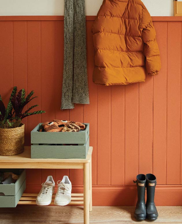
2. Terracotta and Clay Add Natural Warmth
Inspired by sun-baked earth, terracotta and clay tones introduce warmth and personality into any room.
These earthy shades create a welcoming atmosphere while maintaining a sophisticated look.
Benefits of Terracotta and Clay
- Add depth and richness
- Create a grounded, cosy feel
- Complement natural materials
Introduce subtle colour without overwhelming a space
Easy Ways to Incorporate Them
- Accent walls
- Decorative cushions
- Ceramic accessories
- Occasional chairs
- Area rugs
These hues work particularly well in living and dining areas where family and guests gather.
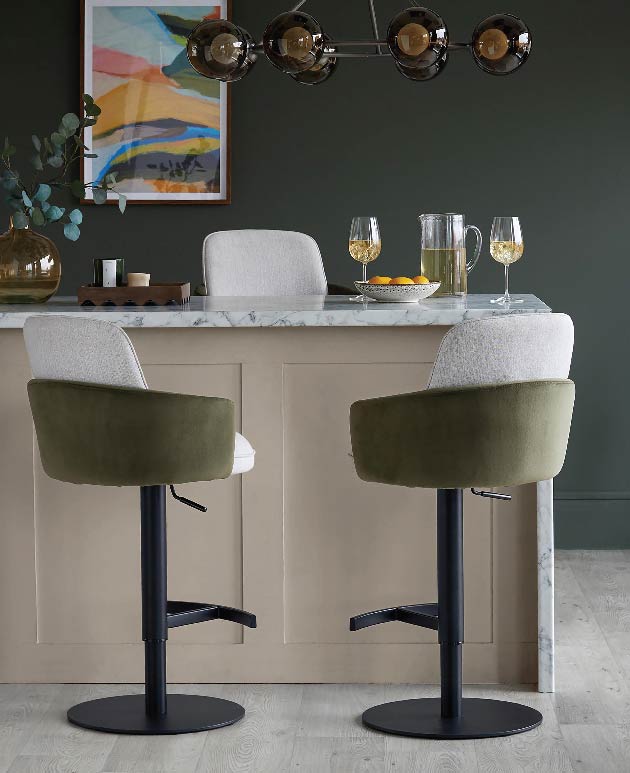
3. Olive and Muted Greens Bring Nature Indoors
If you love calming interiors, olive and muted greens are an excellent choice.
Inspired by nature, these shades provide a soothing backdrop while adding visual interest.
Popular Green Tones
- Olive green
- Sage green
- Moss green
- Eucalyptus green
Why Homeowners Love Them
- Promote relaxation
- Add natural warmth
- Pair beautifully with timber furniture
- Complement leather and metallic accents
- Create a balanced, elegant aesthetic
Ideal Applications
- Feature walls
- Kitchen cabinetry
- Upholstered furniture
- Bedroom accents
The result is a space that feels fresh, serene, and connected to nature.
Colour Tip: Greens with a hint of yellow feel warmer and cosier, while greens with blue tones can feel cooler and more modern.
Colour Tip: A touch of buttery yellow can make a room feel sunlit and effortlessly uplifting.
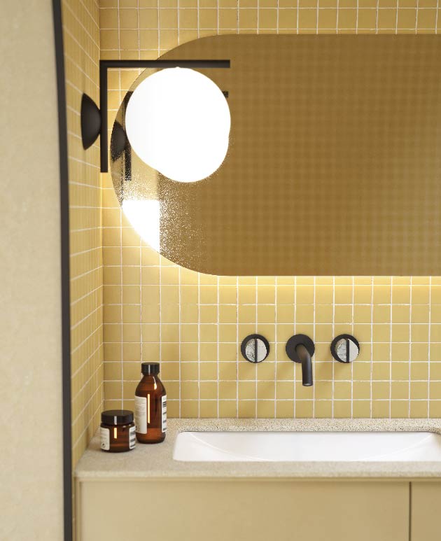
4. Soft Yellow and Ochres Create a Gentle Glow
For homeowners looking to brighten interiors while maintaining warmth, soft yellow and ochres offer the perfect balance.
Unlike bright yellows, these muted shades provide subtle energy and comfort.
Benefits of Soft Yellow and Ochres
- Add warmth without being overpowering
- Enhance natural light
- Create cheerful yet sophisticated interiors
- Pair well with neutral palettes
Where to Use Them
- Kitchens
- Reading corners
- Bathrooms
- Accent décor
- Artwork and textiles
Even small touches can transform the mood of a room.